Many web-based companies are choosing to align their web and mobile interfaces so that their visual branding is the same on all platforms. The result is that websites begin to include mobile elements in their interface. Below are examples of how mobile design is influencing the web.
————————————————————————————————————————————————————————
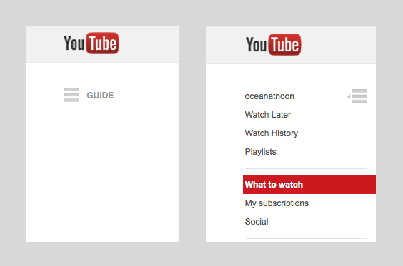
1. Basement Menus: YouTube is now using the “hamburger” icon to represent a hidden menu (usually to the left of the icon).
2. Circular profile icons were/are a mobile trend. (Designers sometimes places profile icons on top of product images in mobile to save on screen space). Now they’re on web too. [Below: Etsy]
3. Pinterest uses the default iOS 6 share icon for its share button. This icon has become universal to people to frequently use mobile software.

4. No, that’s not a screenshot of my phone. That’s responsive web below. Designers are choosing to optimize their websites for mobile, as well as using mobile-looking buttons and text fields for say…login screens.

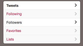
5. Disclosure arrows are used in mobile to indicate that you can tap on a row or cell. They also show up on twitter (web) to let you know that you can see more Tweets, Following, Followers, etc.
 The Design Ocean