Modern masks for crazy times

This year, I have worn masks for pollution, smoke and COVID-19. Here are some modern masks if the average medical mask isn’t good enough for you.

purME: This mask is machine-washable, waterproof, durable and … comes with a clear option. “The mask’s filters trap all sorts of harmful particles such as PM2.5 and allergens, both as airborne or droplets, and you can even upgrade to P100 filters with a simple swap, allowing you to effectively filter out 99.8% particles.”

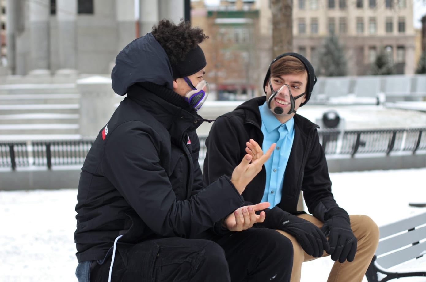
weetbe: transparent mask with fan and screen, which makes it anti-fogging. It protects you and other people.

Breeze: “Face cooling technology & optional magnetic eye shield. 2 designs: filters with valves or no-valves.” – This upside to this mask is that there’s no proprietary filters you need to replace.

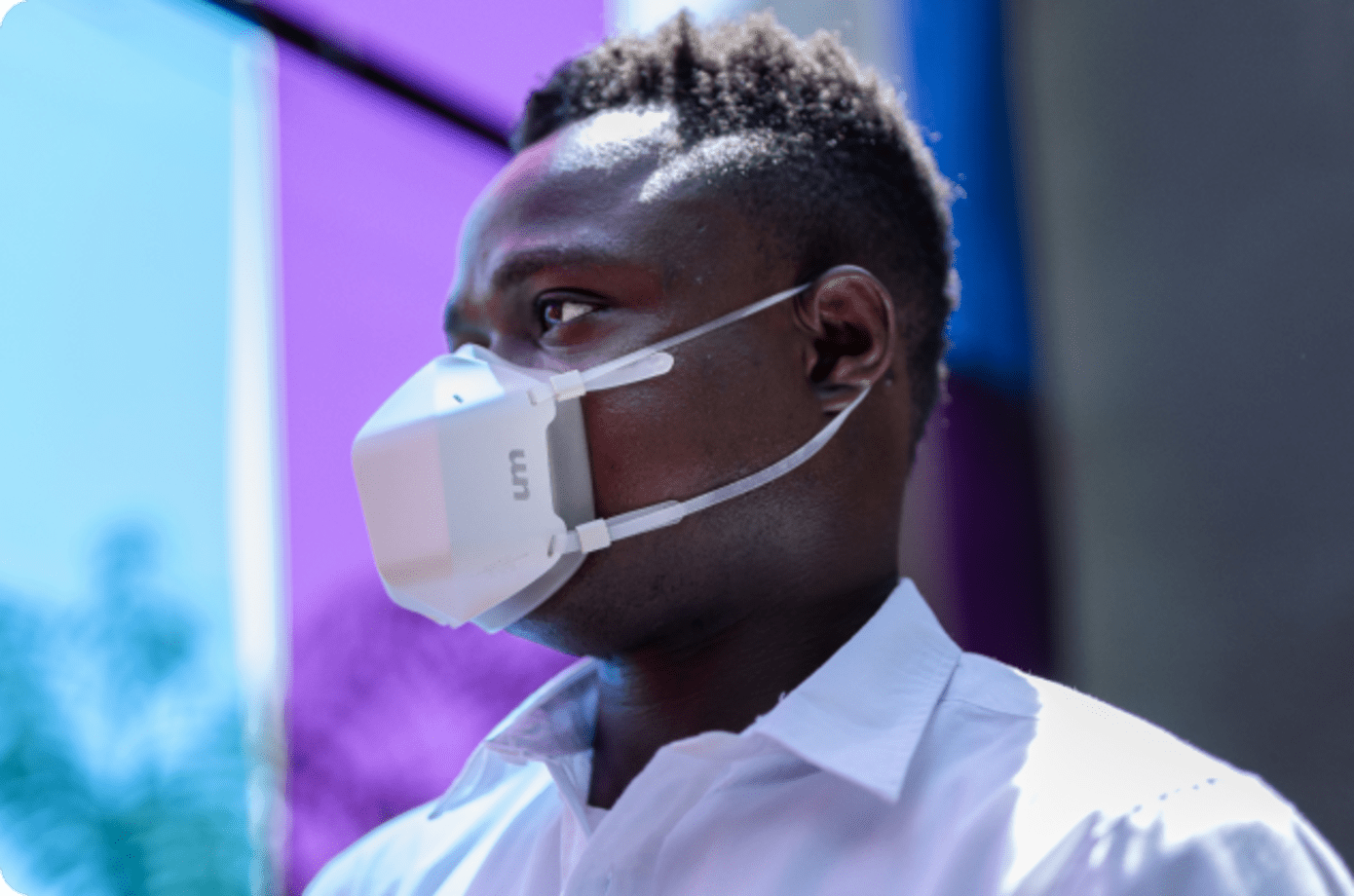
SEEUS95: This is a self-attaching N95 mask that adheres to your skin. (Pretty sci-fi)

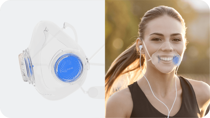
UVMask: It actively sterilizes the air – including the one you breathe out.

It seems like most of these masks have either N95 level filters or can filter out bacteria and viruses. It would be interesting to see how the mask design would be different if the main threat was wildfire smoke (which is the case on the west coast now). The transparent masks are nice if you need to use face-unlock, but they also look a bit alien to me. Maybe it’s because we don’t see many of them around.

I hope some of these make it past the Kickstarter/ Indiegogo phase and into real stores. They definitely cater to people who are high risk and have the ability to afford the price tag. And while these designs are super cool, I do hope though that we won’t have to use them next year. Until then, I appreciate that people are making an effort to solve important, everyday problems with their ingenuity.

Advertisement

The Dribbble of 2019

Screen Shot 2019-11-03 at 11.47.10 AM.png

Dribbble is where designers post their work (also called a “shot”) to gain exposure, get feedback and potential nab a job.

I saw the founders of Dribbble talk about their platform several years ago. They talked about helping people get constructive criticism while deciding on which direction to take their work and emphasized the posts that were in the sketch-phase. That Dribbble is no longer in existence.

Today, it’s a place where designers post polished work that is often the end result of many hours of pixel pushing. This high fidelity work is beautiful, and the beauty of everyone’s work has ultimately transformed the platform into a fashion show that’s more eye candy than thoughtful user experiences.

Moreover, designers are starting to use Dribbble as a reference for an aesthetic that you should follow. Highly large radii on card layouts, parallax motion, spring interactions, rounded sans serifs, huge colored drop shadows high on blur, the same glowing chart that is measuring wealth? fitness? brightness? They are everywhere.

There’s many, many UIs that appear clean, because they only use icons. But on closer inspection, you realize that you don’t know what any of the icons do. There are endless onboarding tutorials that are beautifully laid out, except that nobody – I mean nobody – reads onboarding tutorials that are three screen long. There are gorgeous text fields where the outline and suggestion text is so faint it would never pass an accessibility test.  Design is more than pretty images. Design is about usability, function and intent.

As a designer, Dribbble is fantastic for getting visual inspiration for your next app design or ideas for micro-interactions that are fluid and unique. As an employer, it tells you how good someone is with a software program that they could have just learned a week ago and how well they can copy a style. If you want to look for real design, look to the real world – ask people what they are doing, how they do it and what their habits are to developing success in their field. I promise, there’s good stuff.

Understanding art

Do you scratch your head whenever you look at abstract art? I know I do sometimes. Perhaps it’s easier to understand when you break it down as a transition from realism, which humans have struggled to depict for centuries, to styles that more fully express the artist’s point of view about the scene or feeling in front of them.

For example, one of Monet’s earliest paintings looks like this:

Image result for early monet painting

He studied art classically for years before experimenting with looser brushstrokes and more vivid colors while working with other great artists of his era.

Art becomes interesting when it’s not just a mirror of real life, but an interpretation of real life. Once people were fully able to paint the world accurately, they began to seek other ways of expressing the atmosphere. Impressionism, seeing below (another by Monet), is an example of a scene that has been abstracted to some degree.

Related image

Another example is Picasso. His early work looks like this:

Image result for picasso's early work

It’s incredibly realistic with rich details and classical lighting. He learned formal drawing techniques from his father before he ever dabbled with cubism. It was only later that he developed his own personal style, seen below.

Image result for picasso cubism

Picasso developed cubism as a way to challenge the idea that art should be an exact copy of nature. Rather than continue painting with perspective and foreshortening, he introduce the idea that you can paint one subject from many different angles and perspective. This is what makes his work famous.

Mark Rothko’s early work looks like this:

Mark Rothko, Untitled, late 1920slate 1920s

It’s a traditional watercolor landscape. His later work, on the other hand, looked like this:

Mark Rothko, Sea Fantasy, 19461946

and then even later like this:

Mark Rothko, Untitled, 19531953

These are large paintings that required your participation. He’s implying, by hanging the paintings close to where observers would stand, that the painting is an alternative to real life. There’s a different reality altogether and that it is expressed in the work.

In order to understand abstract art, it’s important to think about these aspects of art – that we started from first being able to full capture a scene realistically with painting to experimenting how the painting could enhance the real world or create a different world. Not many people dare to do this, which is why those artists are famous.

That’s all for now. Until next time, happy museuming.


Product Picks for July

Smart Planter

Lua Planter

This amazing planter, Lua, gives your plant emotions! It uses sensors to measure the soil’s moisture, temperature and light exposure. It also measure your movement, so it peers at you when you walk by. The emotions help you know when it’s thirsty, sick, too hot, etc.

I’m always a sucker for sustainable houseware and packaging of any kind. Gaurav Wali uses pine needles here to create holders and organizers. He uses natural binders and waxes to make this a completely bio-degradable product. The material can also be colored with natural dyes made from vegetables and spices. What a cool way to use something that’s all around us!

lekue_twin_one_1

I would use this Twin Utensil Set daily. When you switch from chopsticks back to western utensils, there’s even an interlock between the fork and knife so that they become one interlock.


Product design picks for June

A bell for runners so you can tell people when you’re coming up behind them – similar to a bell on a bicycle. I think this is pretty genius. This could also just be an app, but I suspect the ring reverberates better if it’s a physical one.

Designer: Kevin John Nadolny

runbell_2

source


An LED that helps you communicate with other drivers. You can view it up to 50 feet away. There are shortcuts to the most used messages, and the controller has large buttons.

Designers: John Stanley, Nina Stanley, Harsha Venna & Harshit Aggarwal

source


A clock that shows you the time in a new way. Because I work as a UX designer, I’m always looking for new interaction patterns and new interfaces – both digital and physical. This one is simply and unique.

Designer: Mattis Boets

source

March picks: thoughtful UX moments

In Singapore, senior citizens can tap their identity card on the sensor at the pedestrian crossing so that they can have 3-13 more seconds depending on the size of the crossing. This takes into consideration everyone’s mobility levels.

This hotel has fire escape plans at ground level, because chances are if it’s smokey you’ll be low to the ground.

Parking lines that go up the wall so you can actually see if you’re parking in the right position. All garages should have this.

source

Idea for expanding creativity

closeup photo of yellow lemon

Creativity is originality and fluency of ideas. It’s something designers ought to be good at. But every now and then, we get stuck too. There are so many constraints. How do we make all of the stakeholders happy? What about that deadline?

Let’s go back to a space where we can play, because, as I learned at a UX conference two years ago, when people view an activity as play, they come up with twice as many ideas as people who view the activity as work. 

Here’s a practice for getting back to idea generation: Give yourself a plain object with no instructions. How can uses can you find for it?


Inclusive design

Mismatch_cover_logo.png

Kat Holmes wrote Mismatch, which talks about how many objects are designed with only one type of user in mind – right-handed computer mouse, pilot seats meant for people who are a certain height, etc – and how these objects lead to exclusion. She then talks about ways to design inclusively for all.

What I really liked about her perspective on disability, which is seen by a lot of people as a personal health condition is that she redefines it as a mismatched human interaction, and that those mismatches are “the building blocks of exclusion.” This definition reframes what normal is supposed to be. In fact, Kat says that there’s no such thing as normal.

No one is the “average.” We’re all a little different, and we all have different needs. Given that over 1 billion people in the world are “disabled.” Given that, it’s easy to see why designing for accessibility is important. It’s not just your grandfather that can’t read your font; it could be someone who is recovering from an eye surgery to someone who has 20/20 vision but is standing in broad daylight squinting at their phone.