Aug: Sites/ideas to play with

Inspiration for when your “new ideas” bucket gets dry.

Screen Shot 2018-08-30 at 10.08.16 AM.png

How do you get better as a designer?

Have you heard the quote “some people work one year twenty times”? It means that you haven’t really grown in that time; your skills have gotten stale and your career hasn’t grown.

There’s a couple things you can tackle right away like learning more technical knowledge and growing relationships

But beyond that, it’s about solving problems that aren’t just yours. Instead of having the mindset of “that’s not my job/role/position,” think about it as an opportunity. If you were working at a startup, you would never say. You would just do it.

Another part of growing a career is continuing to innovate on yourself. Fax machine companies were doing pretty well for a long time and saw no reason to switch their business because they were basing what they were doing on what works “today” (or in their case, what worked twenty years ago.) Today doesn’t last forever. That’s why we need to develop new skills that will be relevant for the future. Can you foresee your job being replaced by something that’s more automated, smart and easy to use?

The way to not become obsolete is to become an active participator in the next generation of your industry. Don’t just be a subject matter expert on a product that exists today. Proactively develop the next wave of that product or idea or thinking. Be the advisor, the coach, the creator. 

Lastly, what are the things you’re telling yourself that are holding you back from doing these things? Is it “I don’t have time?” Nobody has time. You have to make it happen. Or “I’ve always hated group work, therefore I’m not good at it?” Be aware of the words you’re telling yourself.

Happy Monday 🙂


HOW Live Conference

Earlier this month, I attended the HOW Live Conference in Boston, MA. It was full of interesting talks. Here are some highlights:

Sagi Haviv: Partner & Designer, Chermayeff & Geismar & Haviv

Screen Shot 2018-05-09 at 9.14.44 AM.png

The old State Farm logo was difficult to read and was in need of a modern take on it. However, when the firm proposed simplifying the pictogram, they received significant pushback from the CEO. Haviv was told that they needed to keep the rounded square border.

In order to convince State Farm to ditch the rounded square border altogether, they put together a number of logos that had been redesigned recently. Then, they showed what the halfway point of those logos would be.

Screen Shot 2018-05-09 at 9.15.40 AM.png
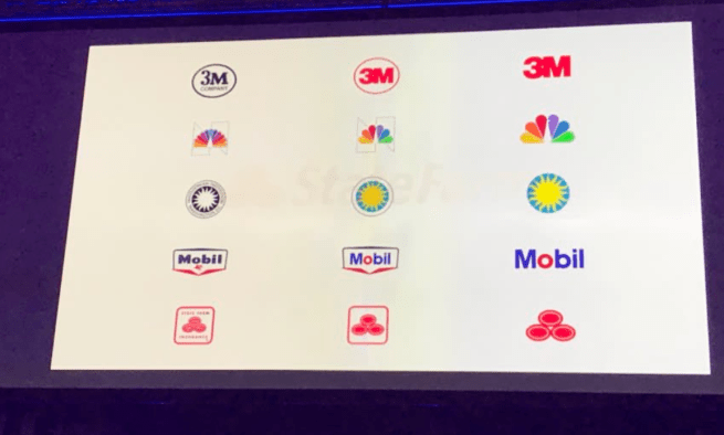
This convinced State Farm to go with the simplified three-oval approach.


Stephen Gates: Head of Design Transformation, LinkedIn; Creator of The Crazy One Podcast

Stephen talked about the importance of design in large companies and how to build trust and confidence in design.

He asked us:

  1. Can you express the value of your team beyond your work?
  2. What is your team’s identity outside of the company.
  3. Create a scalable ecosystem for design: As a design team, what are your set of beliefs?

He also talked about his framework for thinking about design environments inside a company:Screen Shot 2018-05-09 at 9.18.02 AM.pngScreen Shot 2018-05-09 at 9.18.35 AM.png

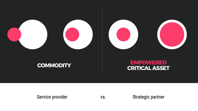
This helped to visualize an idea that I’d been personally trying to capture for a long time. It’s a handy tool to help you think about where your design team is and where it can go.


Daniel Pink: #1 New York Times Bestselling author

Daniel Pink spoke about the science of perfect timing. Using big data, he has developed principles for everyone to use for when to accomplish certain kinds of tasks.

Pink talks about how everyone has a chronotype.

15% are early birds, 20% are night owls and the rest are “third birds.” Most people see a peak, a trough and then a recovery in their day to day work performance.  
= People tend to perform better at the beginning of the day.

Screen Shot 2018-05-09 at 9.21.22 AM.png

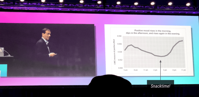
He talked about using timing to work better and smarter. If you know that you have more energy at the beginning of the day, use it to do analytical work. Set time aside in the afternoon when you’re more sluggish to do administrative work.

Screen Shot 2018-05-09 at 9.21.16 AM.png


Product design picks for March

A jar that expands and contracts based on the quantity of food you need it to hold. [Designer: Terence Myers (Botto Design)]

“Just expand the jar, open the lid, and pour your contents in before closing the lid and pressing down on the top. Air releases from the valve on the jar’s lid, packing your food in tightly not only to make the jar more compact but to also remove excess air from inside the container, keeping your food fresher for longer.”

A smart mirror that gives you a weather and calendar preview of the day. [Designers: Hongseok Seo, Minkwan Seo & Jo-Young Choo]

It’s connected to the internet, can play for favorite tunes and helps you get ready for the day.

Bose AR sunglasses. These devices funnel sound towards the wearer’s ears. It could be interesting to combine good graphics with Bose’s sound quality. These look more natural than the AR glasses we usually see. source


Focus

Screen Shot 2018-02-16 at 11.14.46 PM

In large organizations, my experience has been that having too many ongoing projects at the same time for the same product leads to a messy outcome. The ideal scenario involves everyone having a single vision and general focus area.

Imagine you’re designing a sushi restaurant. There are 3 different leaders of this sushi restaurant. One of them wants to focus on sashimi, one wants to diversify the palette with western food and one wants to serve regular sushi. While they all have unique strengths that they can bring to the table (no pun intended), the marketing ad and menu for that restaurant will start to get really confusing.

Here’s a real life example. Public transit in the bay area is managed by multiple agencies. CalTrain runs north/south of the peninsula, Muni serves San Francisco and Bart connects the northern half of the peninsula to East Bay. Additionally, VTA serves San Jose and South Bay cities and AC transit serves East Bay towns. I’ve run into more confused tourists in San Francisco than anywhere else, because no one knows which bus/tram/train to take. When I first arrived in the city, I was dumbfounded by how nonsensical the system was. In contrast, Boston’s MBTA is responsible for the commuter rail, subway system and buses.


Above: San Francisco transit systems

I feel that the same applies to tech products as well. Vurb was an app that helped you figure out what to do in your spare time. You could plan an event with friends, whether it was concerts, music or theatre. They had a lot of interesting concepts – especially that of collaborating with other folks on getting together, but it was hard to figure out when exactly I would need this app. They couldn’t gain mass traction and sold to Snapchat for $110 million+. However, apps like Instagram have remained resilient in today’s mature app market because it does one thing really, really well. It allows people to share a moment through a photo and for other people to see that photo. Its simplicity is what allows it to work.

      IMG_1170.png

To create a product that people will use, its purpose must be clear and intentional. It seems obvious, but often we try to stack too many features on top of a product, which makes it less desirable in the end.

That’s probably a sign for me to give this blog a focus. Until next time!


Designing Design

My cousin, currently studying product design at Carnegie Mellon University, told me about Designing Design by Kenya Hara. Hara is a design advisor at MUJI, the Japanese product brand. In his book he writes about Japanese design and thoughtful redesigns of everyday objects. The book is available on amazon (#whysoexpensive), and here’s an excerpt:

Screen Shot 2018-01-15 at 7.23.26 PM.png

Itsuko Zenitani Ceramics

IMG_5010

Today, I visited the Arts and Crafts Cooperative in Berkeley, CA. Towards the back, I noticed a set of bowls that had really interesting glaze on it. The top was a glossy blue while the bottom had been textured to look like wood. It was one of those rare moments where I immediately felt that I had to tell the artist how awesome I thought this was. So, Itsuko Zenitani – map props. Your ceramics work is stunning.

IMG_501w1 (1)