The challenge of communicating climate change

Screen_shot_2012-03-24_at_7

(http://www.ipcc.ch/presentations_and_speeches/presentations_and_speeches.shtml#.T25Je44zNWs)

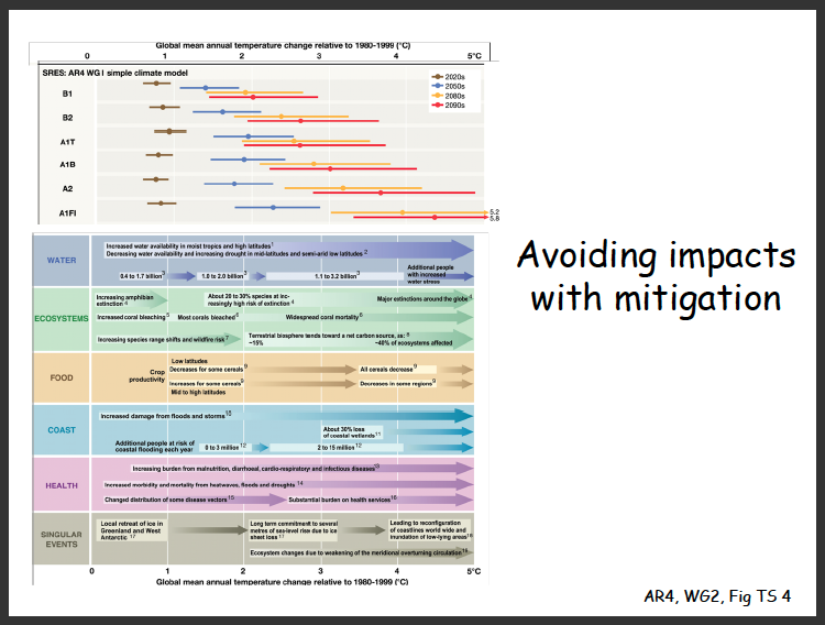
Look at the chart above carefully. What do you see?

I see a stuffed chart with some legible text, some visual cues as to where I should be looking and code that I don’t understand. (and yes, I noticed the comic sans type too). It isn’t a complicated document, yet it could potentially be to someone who isn’t familiar with how to read it.

This was a slide in a presentation given at the United Nations Framework Convention on Climate Change’s 15th conference in Copenhagen (2009). The event was titled “IPCC Findings and Activities and their Relevance for the UNFCCC Process.”

Documents like this should probably consider presentation in the presentation. As a scientific document, you want to make sure that it’s readable. As a document that the public is going to view, you want to make sure that it’s understandable. As a “government” document, you want to make sure it looks professional.

This isn’t even that bad, but it’s not what it could be.

If we want people to understand a subject matter and how urgent it is to address the matter, we want it draw people in. It’s the difference between saying “wow that’s amazing” and “I guess that suffices.”

Scientists aren’t communicating with us yet, and that’s a fact. They’re mainly communication with each other, which means using jargon that will fly pass our ears.

The Christian Science Monitor wrote a few days ago, “The American public is generally illiterate when it comes to science (so says the National Science Foundation). And when American scientists complain about public illiteracy and lethargy on the vitally important subject of climate change, they also have themselves to blame.

Generally, those who know the most about climate – and other important scientific fields – are locked up in their university ivory towers and conference rooms, speaking a language only they can understand.

And they speak mostly to each other, not to the general public, policymakers, or business people – not to those who can actually make things happen.

This is dangerous. We live in an age when scientific issues permeate our social, economic, and political culture. People must be educated about science and the scientific process if we are to make rational and informed decisions that affect our future. Indeed, a well functioning democracy requires it.

But instead, the relative absence of academics and academic scholarship in the public discourse creates a vacuum into which uninformed, wrong, and downright destructive viewpoints get voiced and take hold.”

This is exactly what frustrates me so much. It’s that lack of good communication doesn’t just hinder progress, it pushes us backwards into a hole of misunderstanding. It makes being judgemental and ignorant easy.

As designers, we have the potential to solve a lot of these types of problems. We can bridge the communication gap between the technical experts and everyone else. We need better.

Ferdi Rizkiyanto

Zinio_low2BeachflatOben-casestudy02

This is some of the best digital manipulation work I’ve ever seen. The images Ferdi makes appear so real and are at the same time so imaginative. On top of that, I love how easy it is to understand the message being conveyed by them.

Definitely go check out the rest of his work here: http://ferdi-rizkiyanto.blogspot.com/

“The Challenge to Make Chocolate Child Labour Free”

I just found these videos, and I’m incredibly sad to hear that 300,000 children are employed on cocoa plantations where they work in conditions that expose them to toxic pesticides and injury. It seems that so much of what we consume these days is part of a system that involves exploitation of human labor. The socio-economic imbalance that capitalism spawns is something that makes me question what we as a society really value.

Dr. Lisa Randall @ RISD

Lisarandall

Dr. Lisa Randall gave a talk at RISD a few days ago as part of the Presidential Shared Voices Lecture Series. Dr. Randall is a theoretical physicist and also one of the most brilliant scientists alive. She’s been listed in TIME Magazine’s Top 100 Most Influential People of 2007 and received her doctorate at Harvard University. Her work? Dark matter, string theory and other crazy fascinating subjects. I don’t understand quantum mechanics per se, but I still love the ideas proposed in this field.

I just wanted to talk about one idea that Dr. Randall mentioned in the lecture, which is how the context of an object is affected by scale. She used the example of the Eiffel Tower. From street-level, we see metal beams and arches. From another building that’s quite a bit further away, we might be able to see the whole tower and it’s iconic shape. From a satellite in space, we don’t see anything. Without being close to ground-level, we would never even see the Effiel tower or know that it existed. We only discovered the atom when we had the available technology to view it. The same with quarks. We are now using the Large Hadron Collider to try and find the Higgs Particle.

We don’t know what the smallest particle is unless we have the technology to see it. What is small? What is large? We don’t really know, because we are judging the scale of everything based on its relation to us. It extends in both directions. The observable universe is 46.6 billion light years in diameter, because that as far as we can calculate. Dr. Randall remarked that she saw no reason why there wouldn’t be multiple universes, each expanding at different rates.

Nature created limitations for what our eyes could see, but it didn’t on what our brains could imagine. For all we know, there could be ever smaller particles existing within the universe that we will never be able to get to the bottom of. There may be an infinite number of universes, each with different forces governing it.

Everything is essentially relative to us. But imagine if we could see beyond this and think more often beyond it. How large/small are we in the scale of everything? We’ll never really know.

Creaktif

Screen_shot_2012-01-25_at_10

Check this website out!

  • Moving the mouse from left to right changes the viewer’s perspective of the background image.
  • Clicking on the links in the center leads to some interesting effects within the center-top circle. Each image zooms in and pixelates to transition to the next image.
  • Because the background image is a 3D rendering, it appears that some parts of it are closer to you than others.

All in all, a very cool webpage.

Wikipedia’s SOPA Protest

While Wikipedia was blacked out for a day, I decided to go and twitter and see how people were reacting to the protest. Most seemed to be in support of it; some folks did contact their representatives (thank you), some others used it to brandish their web skills and spread word about how to circumnavigate it and others were just plain annoyed that they couldn’t use it. Some tweeted about the things they were about to look up, which made me realize that people use Wikipedia to search for some seriously specific things.

Untitled-1

Got milk? Interactive website

Screen_shot_2012-01-20_at_12

Got Milk? (click to see website)

This is a great example of a website that really uses interactive elements to its advantage. The animation isn’t overdone, and it doesn’t come off as corny. The graphics are also very realistic and clean. The best part, though, has to be the sound. When the milk bottle spins, it makes that heavy glass-on-table scraping noise. It makes the whole experience real.