These flying ships by Luigi Prina made of thin paper and balsa wood actually fly. Read More.


Many web-based companies are choosing to align their web and mobile interfaces so that their visual branding is the same on all platforms. The result is that websites begin to include mobile elements in their interface. Below are examples of how mobile design is influencing the web.
————————————————————————————————————————————————————————
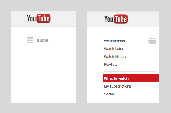
1. Basement Menus: YouTube is now using the “hamburger” icon to represent a hidden menu (usually to the left of the icon).
2. Circular profile icons were/are a mobile trend. (Designers sometimes places profile icons on top of product images in mobile to save on screen space). Now they’re on web too. [Below: Etsy]
![]()
3. Pinterest uses the default iOS 6 share icon for its share button. This icon has become universal to people to frequently use mobile software.

4. No, that’s not a screenshot of my phone. That’s responsive web below. Designers are choosing to optimize their websites for mobile, as well as using mobile-looking buttons and text fields for say…login screens.

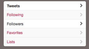
5. Disclosure arrows are used in mobile to indicate that you can tap on a row or cell. They also show up on twitter (web) to let you know that you can see more Tweets, Following, Followers, etc.
Every since I’ve joined dribbble, I’ve noticed that there are certain styles on the site that have pop up again and again and again. Some are genuinely awesome ideas, others are just passing fads.
The app icon/logo with the slanted shadow

http://dribbble.com/shots/1107326-Everything-is-going-flat
![]()
http://dribbble.com/shots/1125931-Swiiish-Icon

http://dribbble.com/shots/1121450-Xclv-Touch-Logo-icon?list=debuts
http://dribbble.com/shots/829485-Moose?list=searches

http://dribbble.com/shots/1116106-Riko-Music-icon?list=debuts
The floating screen(s)
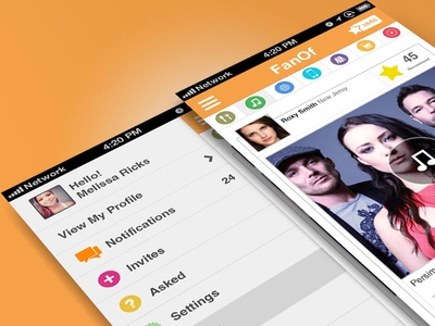
http://dribbble.com/shots/1126297-Fanof-Screen

http://dribbble.com/shots/1126024-Swiiish-Screens
http://dribbble.com/shots/1117873-Locqi?list=debuts
http://dribbble.com/shots/1114948-Lively-iPhone-App?list=debuts
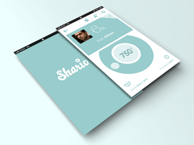
http://dribbble.com/shots/1113097-Shario
The geometric animal illustration
http://dribbble.com/shots/278494-Mystery-Project-11-1

http://dribbble.com/shots/800706-Buck?list=searches

http://dribbble.com/shots/326243-deer-2?list=searches

http://dribbble.com/shots/980782-Geometric-Halftone-Panda?list=searches


Emi Grannis, CA jewelry designer, has a really unique taste in items that are contemporary, beige and rustic. They really match my personal taste in apparel, interiors and everything in between. See below (and go here for more)


 emi
emi 

It’s the Christmas season again, and the expectation to get something great for the folks back home is set high above my frame. I decide to get my parents a kayak, the inflatable kind that fits inside the car. They’ve always talked about getting one, but never have because they had worries about transporting one from our home to X destination. So I was pretty happy when I made the purchase. It was a big one, that’s for sure.
When it was delivered to me earlier to week, I found a warning label on the box that says “This product contains chemicals known to the State of California to cause cancer, or birth defects or other reproductive harm.” Now, I know that Prop 65 demands that this warning label is placed on many products that may not even have any dangerous chemicals in them, but I wanted to check with the company anyway to see what was up with the label.
I decided to call the Sea Eagle customer support number yesterday. “Hi, I have a question about the warning label on the Kayak I just bought”…”Ok.” I ask what parts of the product contain the chemicals mentioned on the label, and the lady on the other end replies, “I have no idea.” “Is there anyone I could talk to who might know?”…”No.” “There’s no one on your staff who might know?”…
Needless to say, this conversation was not very fruitful. I knew that I wasn’t getting anywhere, but I wanted to know if the company cared at all about customer concerns like mine. If there’s lead in the PVC material used to make the kayak, I want to know if exposure to it is going to harm the people using it. I want to know what’s in the things that I buy. I want to know when companies are going to start being open with their customers. I want some transparency, and yesterday, I didn’t find it.

This is a conversation that I have with my product and graphic design friends on a frequent basis. If the ratio of design students is relatively balanced between genders, then why don’t we see more female designers in the actual workforce? Is it the lack of role models? After all, how many female designers did we see in our history books? Is it lack of self-confidence? Or is it that women have children at the height of their careers? In every design company I’ve worked at men have outnumbered women. I’m not trying to make a feminist statement, I’m just curious. So I tried to search for something that might answer my question.
…most of the designers who win commissions from those companies are male. The same applies to the AIGA’s highest profile members. The only woman except Ms. Jongerius among the 22 designers or design teams to be listed on Vitra’s Web site for designing its office furniture is Ray Eames, who died in 1988.
Why do so few women reach the top of design? The short answer is the same lack of self-belief and entitlement that dogs them in every other profession, combined with opposition from those who commission the majority of design projects, most of whom are men. The graphic designer Paula Scher once described this as the “Why did I get the woman?” syndrome.
Barron studied young artists at the San Francisco Art Institute and at the Rhode Island School of Design….In asking the students the question. Do you think of yourself as an artist? 67% of the women said no and 60% of the men said yes. When asked the question, In comparison to the work of others at the Institute, is your work particularly unique or good? 40% of the men and 17% of the women answered yes. And when asked In comparison to the work of others at the Institute, is your work inferior? the percentages were reversed: 40% of the women felt their work was inferior and 14% of the men agreed.
Barron pointed out that this revealed a difference in self-image in the women, and that these differences were not indications of the real quality of the men’s and women’s art work, indicating that “the quality of the women’s art work was equally high.” The main difference came in the intensity of the commitment of the young artists to their work. Almost all of the men said their art work was their life, was necessary for life, and was their main reason for living: “Without painting I couldn’t function.”
There are many more examples, studies and quotes, but they all center around the same themes of self-perception in some way or another.
So maybe it’s all of the above.
Maybe it’s something I’ll figure out when I turn 30, because nothing I read is satisfying my curiosity. My main priority right now is my work and my art, and I would also like to think that I have self-belief. I also know that many of my female friends feel the same. They’re finding jobs at design consultancies, healthcare start-ups, famous shoe companies, etc and are doing well in those spaces, which is why they’re also asking me “where are all the women?”
I guess we’ll have to see.
Maybe I’ll come across this blog in ten years and make an addendum to this post.
We made the front page of MIT news yesterday. The product design and development class at MIT held its final presentations last Saturday. I was a part of the tablet computer backpack group the writer mentions at the beginning of the article.
Here’s the link.

(http://www.ipcc.ch/presentations_and_speeches/presentations_and_speeches.shtml#.T25Je44zNWs)
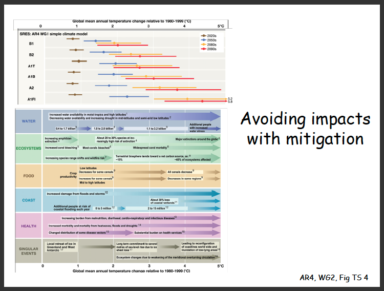
Look at the chart above carefully. What do you see?
I see a stuffed chart with some legible text, some visual cues as to where I should be looking and code that I don’t understand. (and yes, I noticed the comic sans type too). It isn’t a complicated document, yet it could potentially be to someone who isn’t familiar with how to read it.
This was a slide in a presentation given at the United Nations Framework Convention on Climate Change’s 15th conference in Copenhagen (2009). The event was titled “IPCC Findings and Activities and their Relevance for the UNFCCC Process.”
Documents like this should probably consider presentation in the presentation. As a scientific document, you want to make sure that it’s readable. As a document that the public is going to view, you want to make sure that it’s understandable. As a “government” document, you want to make sure it looks professional.
This isn’t even that bad, but it’s not what it could be.
If we want people to understand a subject matter and how urgent it is to address the matter, we want it draw people in. It’s the difference between saying “wow that’s amazing” and “I guess that suffices.”
Scientists aren’t communicating with us yet, and that’s a fact. They’re mainly communication with each other, which means using jargon that will fly pass our ears.
The Christian Science Monitor wrote a few days ago, “The American public is generally illiterate when it comes to science (so says the National Science Foundation). And when American scientists complain about public illiteracy and lethargy on the vitally important subject of climate change, they also have themselves to blame.
Generally, those who know the most about climate – and other important scientific fields – are locked up in their university ivory towers and conference rooms, speaking a language only they can understand.
And they speak mostly to each other, not to the general public, policymakers, or business people – not to those who can actually make things happen.
This is dangerous. We live in an age when scientific issues permeate our social, economic, and political culture. People must be educated about science and the scientific process if we are to make rational and informed decisions that affect our future. Indeed, a well functioning democracy requires it.
But instead, the relative absence of academics and academic scholarship in the public discourse creates a vacuum into which uninformed, wrong, and downright destructive viewpoints get voiced and take hold.”
This is exactly what frustrates me so much. It’s that lack of good communication doesn’t just hinder progress, it pushes us backwards into a hole of misunderstanding. It makes being judgemental and ignorant easy.
As designers, we have the potential to solve a lot of these types of problems. We can bridge the communication gap between the technical experts and everyone else. We need better.


I found out about the work of Rex Ray through a classmate in web design class recently, and I’m really glad I did, because it’s amazing. The colors are so vibrant and the compositions are really well thought out. I find them really playful and unique.
Take a look at his work on his official website here.
Severn Studios (Bristol, UK) does some amazing illustration work. Below are bits of their illustration work. Check out the entire prints and more here.