The Dribbble of 2019

Screen Shot 2019-11-03 at 11.47.10 AM.png

Dribbble is where designers post their work (also called a “shot”) to gain exposure, get feedback and potential nab a job.

I saw the founders of Dribbble talk about their platform several years ago. They talked about helping people get constructive criticism while deciding on which direction to take their work and emphasized the posts that were in the sketch-phase. That Dribbble is no longer in existence.

Today, it’s a place where designers post polished work that is often the end result of many hours of pixel pushing. This high fidelity work is beautiful, and the beauty of everyone’s work has ultimately transformed the platform into a fashion show that’s more eye candy than thoughtful user experiences.

Moreover, designers are starting to use Dribbble as a reference for an aesthetic that you should follow. Highly large radii on card layouts, parallax motion, spring interactions, rounded sans serifs, huge colored drop shadows high on blur, the same glowing chart that is measuring wealth? fitness? brightness? They are everywhere.

There’s many, many UIs that appear clean, because they only use icons. But on closer inspection, you realize that you don’t know what any of the icons do. There are endless onboarding tutorials that are beautifully laid out, except that nobody – I mean nobody – reads onboarding tutorials that are three screen long. There are gorgeous text fields where the outline and suggestion text is so faint it would never pass an accessibility test.  Design is more than pretty images. Design is about usability, function and intent.

As a designer, Dribbble is fantastic for getting visual inspiration for your next app design or ideas for micro-interactions that are fluid and unique. As an employer, it tells you how good someone is with a software program that they could have just learned a week ago and how well they can copy a style. If you want to look for real design, look to the real world – ask people what they are doing, how they do it and what their habits are to developing success in their field. I promise, there’s good stuff.
Advertisement

Product design picks for June

A bell for runners so you can tell people when you’re coming up behind them – similar to a bell on a bicycle. I think this is pretty genius. This could also just be an app, but I suspect the ring reverberates better if it’s a physical one.

Designer: Kevin John Nadolny

runbell_2

source


An LED that helps you communicate with other drivers. You can view it up to 50 feet away. There are shortcuts to the most used messages, and the controller has large buttons.

Designers: John Stanley, Nina Stanley, Harsha Venna & Harshit Aggarwal

source


A clock that shows you the time in a new way. Because I work as a UX designer, I’m always looking for new interaction patterns and new interfaces – both digital and physical. This one is simply and unique.

Designer: Mattis Boets

source

Idea for expanding creativity

closeup photo of yellow lemon

Creativity is originality and fluency of ideas. It’s something designers ought to be good at. But every now and then, we get stuck too. There are so many constraints. How do we make all of the stakeholders happy? What about that deadline?

Let’s go back to a space where we can play, because, as I learned at a UX conference two years ago, when people view an activity as play, they come up with twice as many ideas as people who view the activity as work. 

Here’s a practice for getting back to idea generation: Give yourself a plain object with no instructions. How can uses can you find for it?


Inclusive design

Mismatch_cover_logo.png

Kat Holmes wrote Mismatch, which talks about how many objects are designed with only one type of user in mind – right-handed computer mouse, pilot seats meant for people who are a certain height, etc – and how these objects lead to exclusion. She then talks about ways to design inclusively for all.

What I really liked about her perspective on disability, which is seen by a lot of people as a personal health condition is that she redefines it as a mismatched human interaction, and that those mismatches are “the building blocks of exclusion.” This definition reframes what normal is supposed to be. In fact, Kat says that there’s no such thing as normal.

No one is the “average.” We’re all a little different, and we all have different needs. Given that over 1 billion people in the world are “disabled.” Given that, it’s easy to see why designing for accessibility is important. It’s not just your grandfather that can’t read your font; it could be someone who is recovering from an eye surgery to someone who has 20/20 vision but is standing in broad daylight squinting at their phone.

How do you get better as a designer?

Have you heard the quote “some people work one year twenty times”? It means that you haven’t really grown in that time; your skills have gotten stale and your career hasn’t grown.

There’s a couple things you can tackle right away like learning more technical knowledge and growing relationships

But beyond that, it’s about solving problems that aren’t just yours. Instead of having the mindset of “that’s not my job/role/position,” think about it as an opportunity. If you were working at a startup, you would never say. You would just do it.

Another part of growing a career is continuing to innovate on yourself. Fax machine companies were doing pretty well for a long time and saw no reason to switch their business because they were basing what they were doing on what works “today” (or in their case, what worked twenty years ago.) Today doesn’t last forever. That’s why we need to develop new skills that will be relevant for the future. Can you foresee your job being replaced by something that’s more automated, smart and easy to use?

The way to not become obsolete is to become an active participator in the next generation of your industry. Don’t just be a subject matter expert on a product that exists today. Proactively develop the next wave of that product or idea or thinking. Be the advisor, the coach, the creator. 

Lastly, what are the things you’re telling yourself that are holding you back from doing these things? Is it “I don’t have time?” Nobody has time. You have to make it happen. Or “I’ve always hated group work, therefore I’m not good at it?” Be aware of the words you’re telling yourself.

Happy Monday 🙂


HOW Live Conference

Earlier this month, I attended the HOW Live Conference in Boston, MA. It was full of interesting talks. Here are some highlights:

Sagi Haviv: Partner & Designer, Chermayeff & Geismar & Haviv

Screen Shot 2018-05-09 at 9.14.44 AM.png

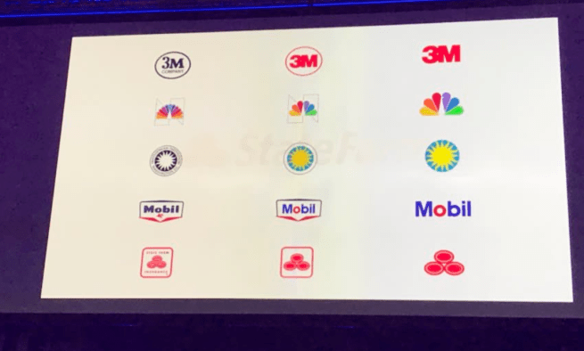
The old State Farm logo was difficult to read and was in need of a modern take on it. However, when the firm proposed simplifying the pictogram, they received significant pushback from the CEO. Haviv was told that they needed to keep the rounded square border.

In order to convince State Farm to ditch the rounded square border altogether, they put together a number of logos that had been redesigned recently. Then, they showed what the halfway point of those logos would be.

Screen Shot 2018-05-09 at 9.15.40 AM.pngThis convinced State Farm to go with the simplified three-oval approach.


Stephen Gates: Head of Design Transformation, LinkedIn; Creator of The Crazy One Podcast

Stephen talked about the importance of design in large companies and how to build trust and confidence in design.

He asked us:

  1. Can you express the value of your team beyond your work?
  2. What is your team’s identity outside of the company.
  3. Create a scalable ecosystem for design: As a design team, what are your set of beliefs?

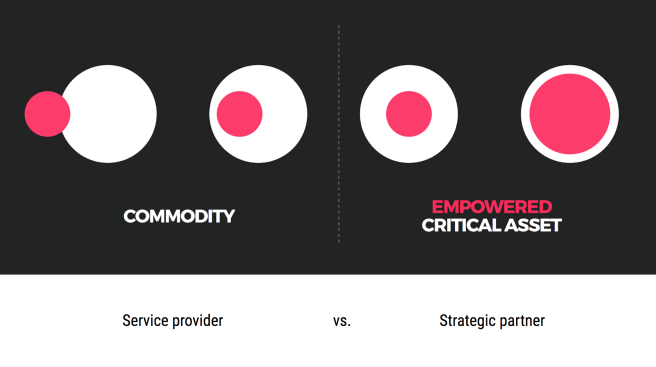
He also talked about his framework for thinking about design environments inside a company:Screen Shot 2018-05-09 at 9.18.02 AM.pngScreen Shot 2018-05-09 at 9.18.35 AM.png

This helped to visualize an idea that I’d been personally trying to capture for a long time. It’s a handy tool to help you think about where your design team is and where it can go.


Daniel Pink: #1 New York Times Bestselling author

Daniel Pink spoke about the science of perfect timing. Using big data, he has developed principles for everyone to use for when to accomplish certain kinds of tasks.

Pink talks about how everyone has a chronotype.

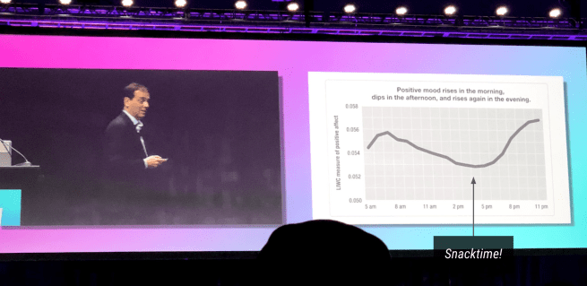
15% are early birds, 20% are night owls and the rest are “third birds.” Most people see a peak, a trough and then a recovery in their day to day work performance.  
= People tend to perform better at the beginning of the day.

Screen Shot 2018-05-09 at 9.21.22 AM.png

He talked about using timing to work better and smarter. If you know that you have more energy at the beginning of the day, use it to do analytical work. Set time aside in the afternoon when you’re more sluggish to do administrative work.

Screen Shot 2018-05-09 at 9.21.16 AM.png