The Dribbble of 2019

Screen Shot 2019-11-03 at 11.47.10 AM.png

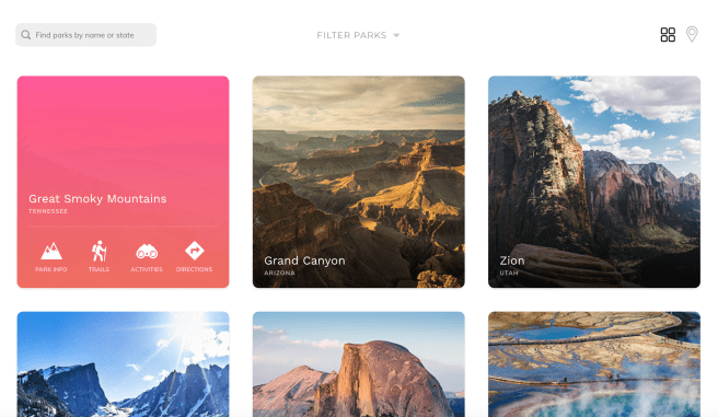
Dribbble is where designers post their work (also called a “shot”) to gain exposure, get feedback and potential nab a job.

I saw the founders of Dribbble talk about their platform several years ago. They talked about helping people get constructive criticism while deciding on which direction to take their work and emphasized the posts that were in the sketch-phase. That Dribbble is no longer in existence.

Today, it’s a place where designers post polished work that is often the end result of many hours of pixel pushing. This high fidelity work is beautiful, and the beauty of everyone’s work has ultimately transformed the platform into a fashion show that’s more eye candy than thoughtful user experiences.

Moreover, designers are starting to use Dribbble as a reference for an aesthetic that you should follow. Highly large radii on card layouts, parallax motion, spring interactions, rounded sans serifs, huge colored drop shadows high on blur, the same glowing chart that is measuring wealth? fitness? brightness? They are everywhere.

There’s many, many UIs that appear clean, because they only use icons. But on closer inspection, you realize that you don’t know what any of the icons do. There are endless onboarding tutorials that are beautifully laid out, except that nobody – I mean nobody – reads onboarding tutorials that are three screen long. There are gorgeous text fields where the outline and suggestion text is so faint it would never pass an accessibility test.  Design is more than pretty images. Design is about usability, function and intent.

As a designer, Dribbble is fantastic for getting visual inspiration for your next app design or ideas for micro-interactions that are fluid and unique. As an employer, it tells you how good someone is with a software program that they could have just learned a week ago and how well they can copy a style. If you want to look for real design, look to the real world – ask people what they are doing, how they do it and what their habits are to developing success in their field. I promise, there’s good stuff.

Advertisement

Product Picks for July

Smart Planter

Lua Planter

This amazing planter, Lua, gives your plant emotions! It uses sensors to measure the soil’s moisture, temperature and light exposure. It also measure your movement, so it peers at you when you walk by. The emotions help you know when it’s thirsty, sick, too hot, etc.

I’m always a sucker for sustainable houseware and packaging of any kind. Gaurav Wali uses pine needles here to create holders and organizers. He uses natural binders and waxes to make this a completely bio-degradable product. The material can also be colored with natural dyes made from vegetables and spices. What a cool way to use something that’s all around us!

lekue_twin_one_1

I would use this Twin Utensil Set daily. When you switch from chopsticks back to western utensils, there’s even an interlock between the fork and knife so that they become one interlock.


Product design picks for June

A bell for runners so you can tell people when you’re coming up behind them – similar to a bell on a bicycle. I think this is pretty genius. This could also just be an app, but I suspect the ring reverberates better if it’s a physical one.

Designer: Kevin John Nadolny

runbell_2

source


An LED that helps you communicate with other drivers. You can view it up to 50 feet away. There are shortcuts to the most used messages, and the controller has large buttons.

Designers: John Stanley, Nina Stanley, Harsha Venna & Harshit Aggarwal

source


A clock that shows you the time in a new way. Because I work as a UX designer, I’m always looking for new interaction patterns and new interfaces – both digital and physical. This one is simply and unique.

Designer: Mattis Boets

source

Aug: Sites/ideas to play with

Inspiration for when your “new ideas” bucket gets dry.

Screen Shot 2018-08-30 at 10.08.16 AM.png

HOW Live Conference

Earlier this month, I attended the HOW Live Conference in Boston, MA. It was full of interesting talks. Here are some highlights:

Sagi Haviv: Partner & Designer, Chermayeff & Geismar & Haviv

Screen Shot 2018-05-09 at 9.14.44 AM.png

The old State Farm logo was difficult to read and was in need of a modern take on it. However, when the firm proposed simplifying the pictogram, they received significant pushback from the CEO. Haviv was told that they needed to keep the rounded square border.

In order to convince State Farm to ditch the rounded square border altogether, they put together a number of logos that had been redesigned recently. Then, they showed what the halfway point of those logos would be.

Screen Shot 2018-05-09 at 9.15.40 AM.png
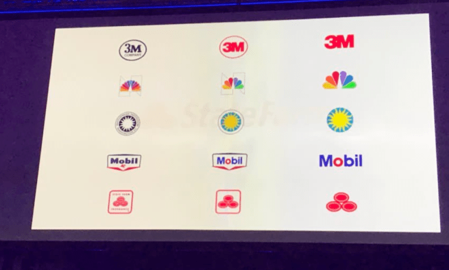
This convinced State Farm to go with the simplified three-oval approach.


Stephen Gates: Head of Design Transformation, LinkedIn; Creator of The Crazy One Podcast

Stephen talked about the importance of design in large companies and how to build trust and confidence in design.

He asked us:

  1. Can you express the value of your team beyond your work?
  2. What is your team’s identity outside of the company.
  3. Create a scalable ecosystem for design: As a design team, what are your set of beliefs?

He also talked about his framework for thinking about design environments inside a company:Screen Shot 2018-05-09 at 9.18.02 AM.pngScreen Shot 2018-05-09 at 9.18.35 AM.png

This helped to visualize an idea that I’d been personally trying to capture for a long time. It’s a handy tool to help you think about where your design team is and where it can go.


Daniel Pink: #1 New York Times Bestselling author

Daniel Pink spoke about the science of perfect timing. Using big data, he has developed principles for everyone to use for when to accomplish certain kinds of tasks.

Pink talks about how everyone has a chronotype.

15% are early birds, 20% are night owls and the rest are “third birds.” Most people see a peak, a trough and then a recovery in their day to day work performance.  
= People tend to perform better at the beginning of the day.

Screen Shot 2018-05-09 at 9.21.22 AM.png

He talked about using timing to work better and smarter. If you know that you have more energy at the beginning of the day, use it to do analytical work. Set time aside in the afternoon when you’re more sluggish to do administrative work.

Screen Shot 2018-05-09 at 9.21.16 AM.png


Focus

Screen Shot 2018-02-16 at 11.14.46 PM

In large organizations, my experience has been that having too many ongoing projects at the same time for the same product leads to a messy outcome. The ideal scenario involves everyone having a single vision and general focus area.

Imagine you’re designing a sushi restaurant. There are 3 different leaders of this sushi restaurant. One of them wants to focus on sashimi, one wants to diversify the palette with western food and one wants to serve regular sushi. While they all have unique strengths that they can bring to the table (no pun intended), the marketing ad and menu for that restaurant will start to get really confusing.

Here’s a real life example. Public transit in the bay area is managed by multiple agencies. CalTrain runs north/south of the peninsula, Muni serves San Francisco and Bart connects the northern half of the peninsula to East Bay. Additionally, VTA serves San Jose and South Bay cities and AC transit serves East Bay towns. I’ve run into more confused tourists in San Francisco than anywhere else, because no one knows which bus/tram/train to take. When I first arrived in the city, I was dumbfounded by how nonsensical the system was. In contrast, Boston’s MBTA is responsible for the commuter rail, subway system and buses.


Above: San Francisco transit systems

I feel that the same applies to tech products as well. Vurb was an app that helped you figure out what to do in your spare time. You could plan an event with friends, whether it was concerts, music or theatre. They had a lot of interesting concepts – especially that of collaborating with other folks on getting together, but it was hard to figure out when exactly I would need this app. They couldn’t gain mass traction and sold to Snapchat for $110 million+. However, apps like Instagram have remained resilient in today’s mature app market because it does one thing really, really well. It allows people to share a moment through a photo and for other people to see that photo. Its simplicity is what allows it to work.

      IMG_1170.png

To create a product that people will use, its purpose must be clear and intentional. It seems obvious, but often we try to stack too many features on top of a product, which makes it less desirable in the end.

That’s probably a sign for me to give this blog a focus. Until next time!


Great User Experience in Real Life

Demilked had a great article on products that have well-thought designs. I want to highlight 8 of my favorite ideas here.

  1. Actual towels for makeup removal. It’s useful, because I hate ruining really nice, white towels with dark mascara.

FullSizeRender_1

2. This shower knob has the temperatures on it, so you’ll know what your favorite showering temperature is.

FullSizeRender_2

3. This highlighter finally lets you see what you’re highlighting.

FullSizeRender_3

4. This bench can be cranked so if it’s wet, you can still turn it to get a dry surface.

FullSizeRender_4

5. More fruits and vegetables could use stickers like this one.

FullSizeRender_5

6. Color-coded baskets that indicate to staff whether you’d like help while shopping.

FullSizeRender_6

7. Chair with slot for bag handle.

FullSizeRender_7

8. This carton tells you how many more glasses of juice you have left.

FullSizeRender